The Cook’s Look - Breaking the 4K Spell
Until recently Super 16 was an affordable way to shoot film, with digital being an affordable way to shoot Super 35, but with the advent of digital S16 old artistic possibilities re-present themselves.
Written and directed by Erez Kavel, co-written with Orit Dabush, and produced by Kastina Communications for yesTV The Chef tells the story of Nimrod (Guri Alfi), an unemployed programmer, offered a second chance as a kitchen help at the prestigious restaurant “Sophia”. Under the strict direction of its charismatic chef, Dori (Gal Toren), “Sophia” struggles to stay relevant in Tel Aviv’s gastronomic world. Although Nimrod starts at the bottom, he is soon taken by the exciting microcosm of the kitchen, the main location of the show.
Before we knew how we wanted this show to look it was clear to us how it should not. With an upscale kitchen and senior cooks mentoring junior ones and critiquing their dishes, we could easily have fallen for the aesthetics of various cooking programs or the cooking reality shows, but this series could not look like MasterChef.
Rotem Sela (left) as Osnat, Dori’s business partner.
What stood out in the scripts is the attention given to hard kitchen labor. Lengthy sequences depicting strenuous, Sisyphean labor that could easily overwhelm anyone just starting out in a kitchen, especially if, like Nimrod, they come from a background of office work. The kitchen is described not as a shiny polished jewel but as a coarse place with rough edges, a lot of wear and tear, potential for injury, and a strong sense of texture. We also knew that with the kitchen being so dominant in the scripts (more than half the shooting schedule), it would serve as an anchor for the cinematography of the entire series.
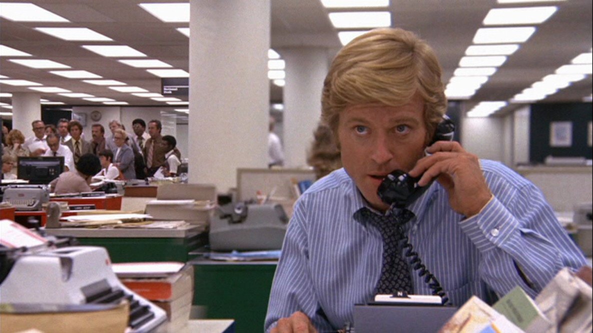
We needed a kitchen where we could easily show Nimrod's climb up the ladder. From doing daunting tasks like washing dishes or grinding parmesan cheese, he progresses to be a regular cook at the Prep Station, from there to the Cold Station and later the Hot Station, narrowing his distance to the Pass - Chef Dori's domain. It can be likened to a newspaper editorial floor where reporters submit their work to the editor-in-chief (Dori), who decides if articles will go to print, need to be tightened (or in our case - reduced) or be thrown in the bin. One of our references was the Washington Post's editorial in Alan J. Pakula’s All the President's Men. Shot by the late Gordon Willis, the film puts emphasis on depths and parallel occurrences on multiple planes of the space, and also on many small pieces of information on paper.
All the President’s Men
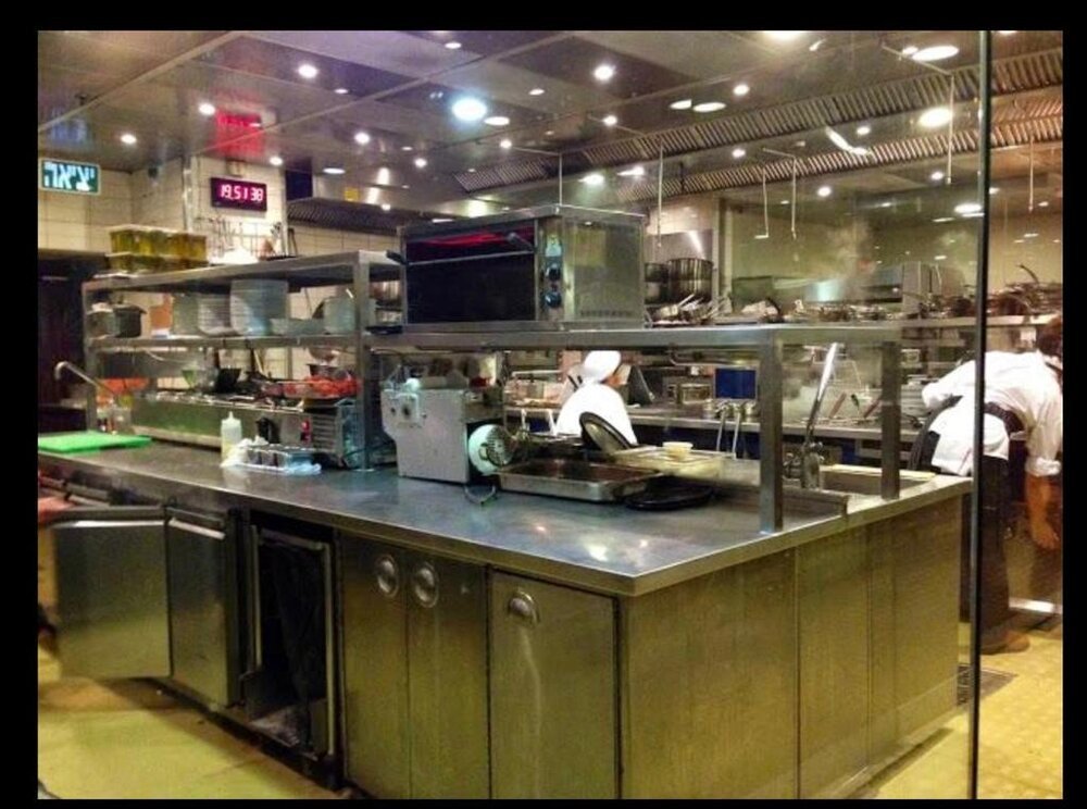
The location we ultimately picked was formerly the Herbert Samuel restaurant in Tel-Aviv which had been closed and vacant for over two years. It required a massive production effort by Kastina, the production company, to revive its infrastructure and a great amount of dressing and props work (orchestrated by Tal Sherman and Omri Yekutieli) to turn this bleak kitchen into a working one, where our cooks could actually prepare all the food seen on screen. Overlooking Tel-Aviv's beach, the kitchen takes up the entire 2nd floor and is surrounded by reflective glass walls and divided into islands (prep, cold station, hot station, pass). This hierarchal design made it easy to outline Nimrod's progress and also allowed us to exploit depths.
In some scenes, we also used split diopters, like in the example from All the President's Men, in order to focus on specific elements in the foreground and in the background without having to insert the entire depth into focus and lose our points of interest (more on that later).
Another important element in the cinematography of The Chef is the desire for a continuous flow of choreography and filming, especially in the bustling service scenes as we felt it would increase the realistic feel of the kitchen. Even if scenes were designed to be cut we did not want to interrupt the shots and the flow in the kitchen, which involved preparing, assembling, and passing a lot of dishes. We wanted every shot to carry the action from start to finish.
For this purpose, we aspired to be able to shoot the set in all directions, 360 degrees at any given moment, and follow the movement along all the paths in the kitchen. Thanks to the surrounding glass walls, even if the fourth wall was behind the camera - it was probably reflected. This of course meant - no room for lights.
One thought behind the lighting design in the Washington Post’s editorial in All the President's Men (along with historical accuracy) was to create an almost shadowless environment, where secrets have nowhere to hide. The Chef is not about investigative journalism, nor is our kitchen a place without secrets, but at intense and stressful moments characters are exposed in flashes of strength and weakness, and we felt that a revealing lighting style would serve this idea. We also had to expose for all the flames that shoot up every now and then, so the powerful LEDs helped us stop down. What's more, cooks use extremely sharp knives and it seemed like a good idea to help them see what they’re doing.
The original lighting of the kitchen was comprised of highly durable but extremely ugly tungsten spotlight fixtures on the ceiling. Those created nasty shadows and a heavy green tint when bounced off the stainless steel elements and the yellowish floor, polluting all the colors.
So inspired by our reference from All the President's Men I asked the production designer Shunit Aharoni and the gaffer Ezer Ketsev, to arrange columns of about 50 household soft LED panels at 6000 kelvin, which they attached to the ceiling using really strong magnets(!) as we were not allowed to make any structural changes. At 6000 Kelvin the colors really pop out. The Pannels weren't as durable as the original fixtures but we only needed them to survive for a few weeks. They could also not be dimmed so we had each panel routed to two separate switches. This way we could at least turn off half of the LEDs inside the panel, decrease the exposure by one stop and adapt to changes in the daylight penetrating from the huge window, which we also covered with ND gels. These household LED panels created a big overhead practical source that exposed the kitchen the way we wanted, preserved the colors, looked great and saved us the need for traditional film lights on set, allowing us to show up in the morning, flip the switch and shoot 360 degrees without interruption.
The natural light from the large window helped us show the passage of time and distinguish days from nights in the kitchen. Like in what we called The Parmesan Sequence, where Nimrod is given the task of breaking and grinding a 30kg lump of parmesan cheese. It literary takes hours. So we placed the camera where it would catch the reflected sun setting on the Tel-Aviv beach.
But the 360-degree capability was not enough. We also wanted to be able to quickly target any spot in the kitchen, follow the characters, reach over all the counters, and change compositions, combining several shot sizes into long takes, again, for the sake of continuity and flow. To achieve this goal, we figured a very long-range zoom lens, with a range of about 20x, might do the trick and also help us avoid our own reflections. In some cases, where reflections were unavoidable, I dressed as one of the cooks to blend in.
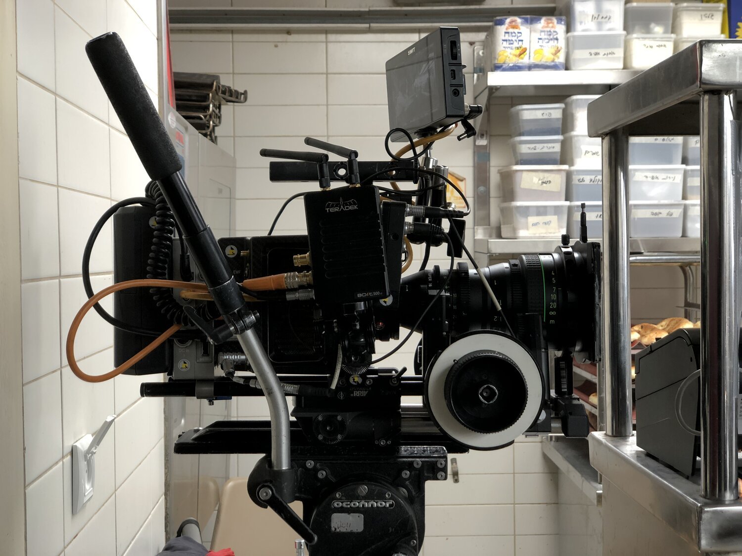
But this created a problem. Super 35 mm long-range zoom lenses tend to be extremely large and heavy, not something you want to bring into a busy kitchen. Daniel Bar, one of the technicians at our rental house Movie Mobile, suggested we use old video lenses which have a better ratio of zoom range to size and weight than 35 mm can offer, and from there the idea arose to shoot with Super 16 lenses, which are relatively compact lenses as they are not meant to cover a larger format. Take for example the 16.5-110 T2.6 ARRI\Zeiss Master Zoom, designed for S35, and a 15-150 T2.8 Canon zoom designed for S16. This tiny lens gives almost double the zoom range of the beast next to it. It wasn’t 20x but it was a step in the right direction.
S35 vs. S16 lenses. I placed a highlighter between them for scale.
And now we’ve hit a bigger complication. Around 2016, broadcast companies in Israel began requiring shows to be captured in 4K, and later Netflix even disqualified certain cameras that did not meet the 4K criteria they’ve set, affectively shelving all Super 35 Alexa cameras as they do not capture true 4K or UHD, but actually upscale the image in-camera. At the time we felt this was a long overdue and welcomed requirement that would move the industry forward to higher standards of content delivery. But now our problem was that there were no cameras capable of capturing Super 16 in 4k resolution, and Super 16 lenses did not cover the larger sensor area required for 4K acquisition, causing deep vignetting around the center frame. The techs at Movie Mobile tested various combinations of enlarging adapters and 4K cameras, but to unsatisfying results, leading us to the verge of giving up on the idea.
That’s when I came across Gus Van Sant’s Don't Worry, He Won't Get Far On Foot, shot by Christopher Blauveltin in digital Super 16 on the ARRI Alexa Mini, which in its 4.0 firmware update ARRI included a new mode that enables a Super 16 crop of the sensor to allow the use of the older, generally underused Super 16 optics with no vignetting. In practice, the resolution captured from the sensor is less than FULL HD (1600x900 upscaled in-camera to 1920x1080), but the film looked great even on my unforgiving, stress testing, big-screen 4K OLED TV. Later I also found out Kathryn Bigelow shot her film Detroit the same way, so I started asking - what if we simply didn't record 4K? To most it sounded like a radical notion, which broadcasters will never approve, saying “we’ll be delivering less than half of what they’re paying for”.
Technically that’s true. But the fact is cinematographers choose vintage lenses to degrade the quality and sharpness and ‘take the edge off’ of Hi-Res sensors on a regular basis. In the previous series I shot, Just for Today, we captured 6K from the huge 35 mm full frame sensor of the Sony Venice camera with rehoused vintage Hasselblads from Whitepoint Optics. We used the large sensor to emulate the look of Medium Format portrait photography and also soften the harsh Hi-Res image (you can read about it here). But if our story requires a different form, an unlikely, smaller format, why should we be concerned that it is too small to sell and force ourselves into using a form that will not serve it as well?
So, I shot some tests with the Alexa Mini in the S16 mode with the Super 16 Canon 10-150 zoom Movie Mobile got for us. The tests looked great even after we upscaled them to 4K, just to see what would happen. As I hoped, nothing dramatic happened, at least nothing harmful, since these lenses were never intended to resolve the high resolutions modern lenses do. For example, the latest ARRI Signature Primes and zooms were engineered to resolve 8K.
I shared my thoughts and concerns with Danna Stern, Managing Director at yes Studios. And she told me this - "If Netflix buys this show from us it won’t be because it's in 4K - it’ll be because it's good. You should stay true to your artistic vision.” I could not have hoped for a better answer, and as soon as we got the green light for the format from Ofir Rabinovich, Head of Production at yes, and Dganit Atias Gigi, Head of Drama at yes, who backed our vision completely, we set off and started looking for our lens with the help of Shani Yancu, CEO of our rental house Movie Mobile.
ARRI Rental Berlin started testing their Super 16 zoom lenses for us. The focus chart videos that came in were quite disheartening because they revealed some of the reasons the world is advancing to large formats. Low resolution, increased grain, distortions, chromatic aberrations, noticeable focus breathing, etc. These are hard-to-sell images, so I asked ARRI to film some people and places, so we could see how these lenses affect the world rather than charts, and now the flaws have become elements of character and texture. In the end, we went with the Super 16 Canon 10.6-180 T2.7 zoom lens from ARRI Berlin, to which we added Super 16 Zeiss Super Speed primes from Movie Mobile. For a couple of scenes we brought the Sony Venice and Anamorphic Scorpio lenses from Movie Mobile, but this is a story for another time.
In addition to all the technical benefits it had for us in the kitchen, the long-range zoom was also an expressive artistic tool. In the example below, Dori and Osnat are having an argument concerning managerial decisions. They are standing on a balcony overlooking Tel-Aviv’s boardwalk, in a starting composition witch gives them an aroma of royalty. But bound by their business partnership, they are also visually imprisoned by the columns of the restaurant. As the argument is heated, we zoom in on the two, removing all the power of the scenery off-screen and ending on them trapped together in a more claustrophobic composition. For now, they will have to put up with each other. The zoom conveys tension and meaning a simple cut would not.
Yet another artistic benefit of Super 16 was the smaller field of view, compared to Super 35. This meant we had to (or could) use wider lenses, get more depth of field, and further exploit the background which on Super 35 would have been too blurry to read faces. The wider focal lengths also extenuate movement, notably on the 12mm and 9mm Super Speeds.
Large depth of field on a 12mm focal length. Thing are looking good for Nimrod (Guri Alfi).
As I mentioned, we also had a set of split diopters. These diopters function differently on Super 16 since the transition from near to far focus is enlarged, doubled in size, making it very prominent. But with all the other technical flaws of the material, I decided to use this "problem" as another element that adds texture and character to the image, making it even more abstract as we zoomed in on the transition line and half the frame became completely blurred.
Since this is an enlarged format that highlights the texture of the raw footage (or in this case - the cropped sensor of the Alexa), I felt we could express the sense of texture that stood out from the scripts, on the footage itself - the digital stock. We shot some tests on location and brought them to our post-production studio LUX STUDIOS, where our colorist Tomer Bahat created for us a LUT inspired by a Super 16 mm film stock we liked, with some modifications to accommodate the color palette designed by the Production Designer, Shunit Aharoni, and to push the Alexa’s sensor to its limit, bringing out all that Super 16 goodness, later also muddying up the footage with even more grain, film dirt and pronounced chromatic aberrations, further distancing our look from MasterChefesque shows.
Our final move to help preserve and accentuate texture was to work at a 90 degrees shutter angle in order to reduce motion blur. This helped with two things. The first was that every drop of water, hot oil, specks of flour, or any other type of particle was clearly registered. The second was when we tracked a character’s movement in the kitchen with the long end of our zoom lens, the background didn’t blur as much as it would at a 180 degrees shutter. On the hectic service scenes, we dialed the shutter all the way to 45 degrees, making small details pop out even more. With the kitchen’s photographic language being our anchor, the choice of a 90 degrees shutter angle carried for the whole show.
Ever since the demand by the broadcasters for 4K capture landed, the industry began, as if under a spell, to move towards large formats, seldom asking whether these forms, even if branded as pristine and prestigious, are right for the story, with the main concern being resolution. And with camera sensors getting bigger and more Hi-Res every year, the general consensus is that when it comes to video - more is more. But the open-mindedness and faith of the people at yesTV show that these priorities are not set in stone. Also, digital Super 16 is cheap! And there are a plethora of quality S16 lenses out there, opening doors to indie filmmakers and students who are willing to break the 4K spell, and get a lot more for a lot less.
The Chef aired NOV 2020 on yesTV and won the Israeli Academy Award for Best Cineatography


